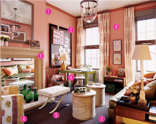
this makeover by steven gambrel from domino is one of my all-time favorites. let's break down why it's working
1 :: a strip of paint a shade darker than the wall adds interest and creates the illusion of molding without the install
2 :: a grown-up mood board provides a space to get personal, keeps the room from feeling too serious and allows for a changing art installation
3 :: a fake fireplace backed in mirror opens the space up and allows pretty objects to shine twice as bright
4 :: a one-of-a-kind chair makes a statement and injects some global flair into a preppy palette
5 :: versatile smaller pieces keep the small room from feeling crowded and serve as both tables and stools
6 :: a lacquered parsons desk introduces a modern touch, especially in a quirky color. a budget big-box buy, it helps make sure the feel isn't too frou-frou; plus, it allows a space to work without creating unnecessary clutter
7 :: wall to wall carpet unifies a space with a lot of furniture. rather than chopping it up, it allows to room to feel larger.
8 :: a sophisicated paint color pairs perfectly with a large-scale paisley print on the soaring drapes. restricting the color palette allows other elements of the room to shine, like the great mix of textures throughout the space.
here are a few more pics to see just how dramatic the makeover was:


Comments
Post a Comment